

Buzz Builder has the following built-in spacing defaults.
- Rows and columns have default margins and padding.
- Modules have default margins.
- An auto spacing feature for small devices is enabled by default.
This feature reduces spacing automatically on mobile devices. This means the layout should look decent at all device sizes without any special effort at manual settings – unless you want to tinker.
If you do want more control, there are several ways you can change spacing in Buzz Builder layouts:
- Locally
You can change the margins and padding of individual rows and columns, and you can change the margins of individual modules. You can set different values for each device size. - Site-wide
You can change the global default settings, which are then used as the defaults in individual rows and modules. You can set global margins and padding values for each device size. By default, the desktop global setting propagates to all device sizes. - Mobile auto spacing
You can disable mobile auto spacing or override it by setting your own values for small devices.
In this article we’ll describe a simple approach to adjusting margins and padding if you’re new to Buzz Builder. For more finely tuned control over spacing and the details about how the final value is determined, see the troubleshooting article on margins and padding.
A quick review of the CSS box model
As shown in the diagram below, the width and height of a border box apply to the content area. The padding, border width, and margin are added to that. Padding is inside the border; margins are outside the border.
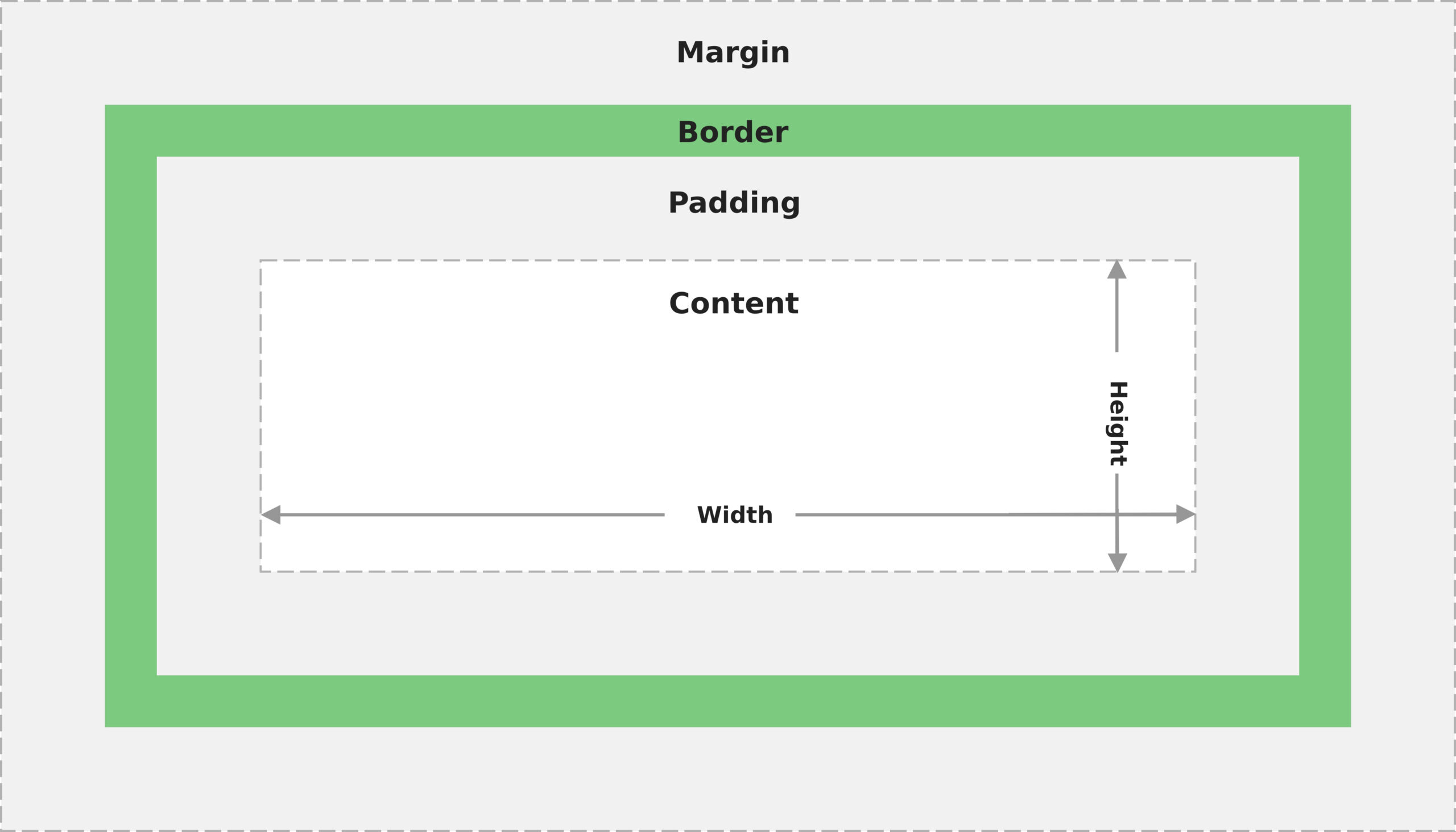
EXCEPTION
If the box-sizing property is border-box, the width and height properties include content, padding, and border.
Individual margin and padding settings
You can set individual margins and padding independently for top, bottom, left and right. You can set all of these values independently for large (desktop), medium (tablet), and small (phone) devices.
When you add a custom margin or padding setting to an individual row, column, or module, this setting is automatically used for medium devices as well, unless you specifically add a different setting for medium devices. For example, if you set a top margin on a row to 100 px, tablets will also display a top margin of 100px.
NOTE
Content modules only have margin settings, not padding settings.
How the value gets set for mobile devices depends on whether global c is enabled (default state) or not. For an explanation of how auto spacing works, see the article on troubleshooting spacing on mobile devices. Without auto spacing, the small device setting inherits the medium device setting, which inherits the large device setting, unless you assign a custom setting.
To set margins and padding for an individual row, column, or module:
- Open a row, column, or module for editing by clicking the wrench icon.
- Click the Advanced tab.
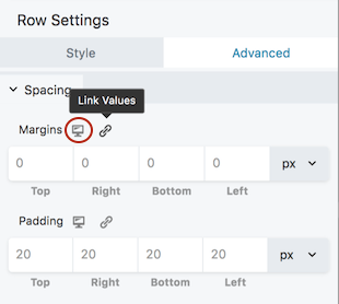
The Margins and Padding fields are shown in the following screenshot. The device size icon, circled in orange, shows that this is the large-device setting.
- Change the margin values as you like.
You can toggle on the Link values icon to synch all four values. When it’s enabled (the icon color changes to blue), then when you can add or change a value in the first field, the other three fields are automatically given the same value. - For rows and columns only, change the padding values as you like.
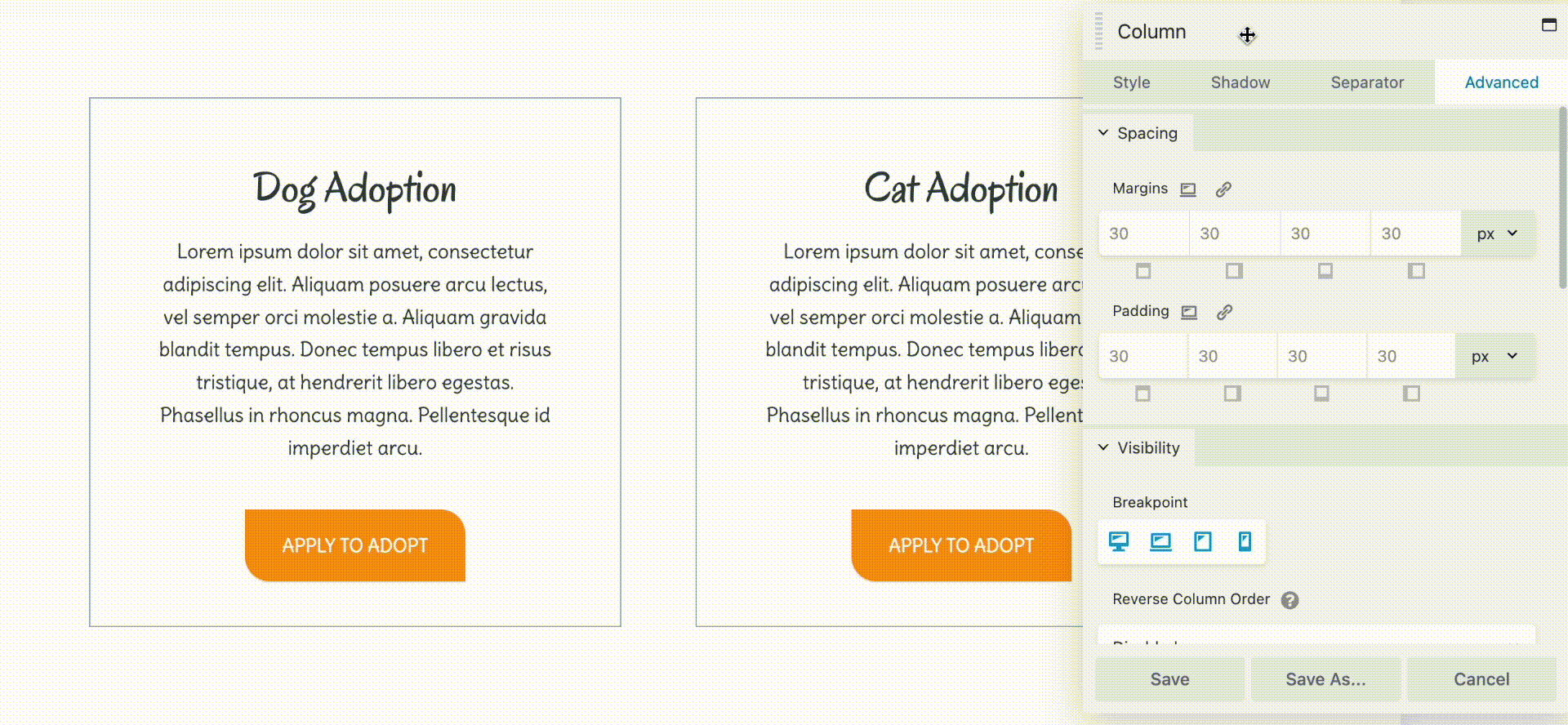
The device size and Link values icons work the same way as for margins. Settings for large devices propagate to smaller device sizes unless you set specific values for them. - (Optional) Click the device icon next to each field to toggle the preview from desktop (large) to tablet (medium) to mobile (small). Check the settings for each device size and add custom values if you want. See the screenshot below that shows the device icon.
- Click Save when you’re done editing.
Tips for setting margins and padding at various device sizes
The interactions among the various ways to set margins and padding at various device sizes can get rather complex, but here’s a recommended basic method for approaching it.
- Lay out your page first for large devices (desktop). As you get more familiar with how Buzz Builder adjusts margins and padding for mobile, you can switch to a “mobile first” approach if you want.
- Lay out your entire page before you start adjusting margins and padding, so you don’t have to keep redoing them as you move items around on the page.
- Make adjustments to individual margins and padding for large devices on the Advanced tab of individual rows, columns, and modules.
TIP
Buzz Builder modules have margins but don’t have built-in padding. An easy way to increase padding for a module is to wrap it in its own column, then change the column padding.
- If you find that you’re consistently making the same changes to margins and padding, you might consider changing the default global settings.
See the article about default global settings and how to change them. - Once you’re happy with your settings for large devices, check the settings for tablets and mobile devices. Go back to the Advanced tab and click the icon next to the Margins or Padding section to change the view, as shown in the following animation. Clicking this icon opens Responsive Editing mode, which lets you edit directly in the medium- and small-device views. See the article about Responsive Editing Mode.
 By default, whatever value you enter for desktop is also used for tablets, but you can change set specific values in tablet view.
For mobile devices, the auto spacing feature automatically reduces the top, bottom, left, and right margins in rows, columns, and modules. It also reduces the left and right padding in rows and columns. You can override auto spacing by entering a specific value in mobile view. See this article for more information about auto spacing and how to disable it.
If margins and padding are not behaving the way you want, see the Related Article on troubleshooting margin and padding spacing.