You can create linear and radial color gradients for row and column backgrounds, background overlays, and row shape layers
To use a gradient as a row or column background or background overlay:
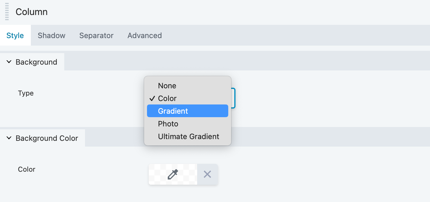
- Choose Gradient as the background type, which exposes the Background gradient section, which is described in the following sections.
Linear gradients
To fully understand how the row or column the settings affect the gradient result, it’s important to understand the basic concepts of CSS gradients.
Here’s a screenshot of the linear gradient settings.
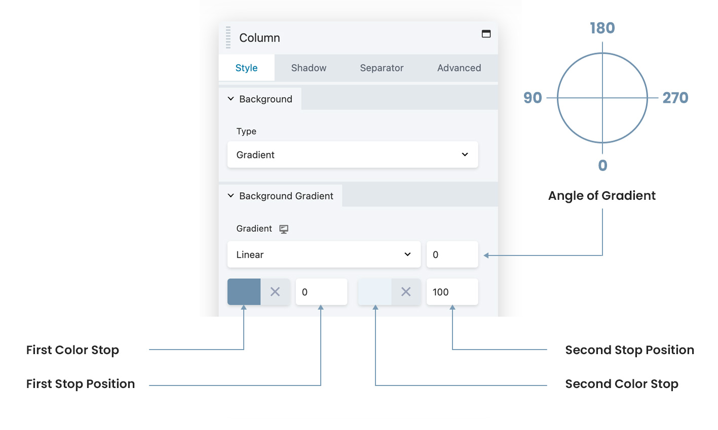
The Buzz Builder linear gradient background requires an angle of gradient and two color stops, described in the following sections.
Angle of gradient
Imagine a straight line with a direction of movement from one end to the other. The angle of gradient rotates the line along a 360-degree axis, where 0% on the line is the start point of Color 1 and 100% is the end point of Color 2, with a continuous transition from one color to the other, as shown in the following screenshot.
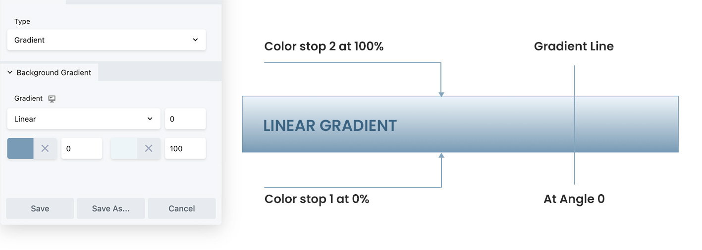
In this screenshot, the gradient angle is 0 degrees, so the gradient line is vertical, the first color stop at 0% equates to the bottom row border, and the second color stop at 100% equates to the top row border.
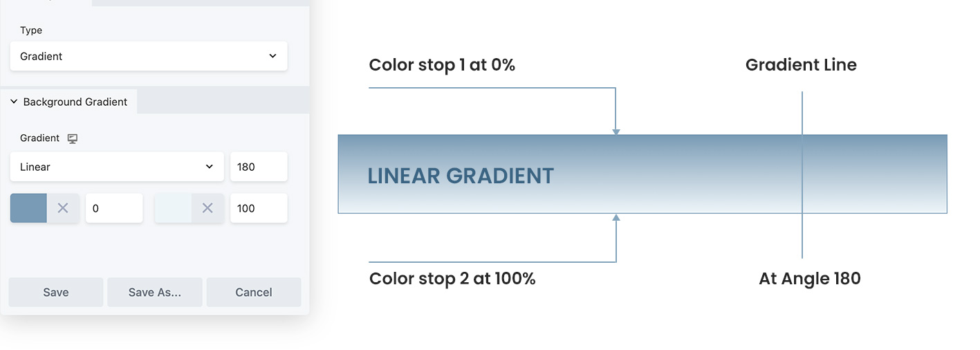
When the gradient angle is 180 degrees, the gradient line is still vertical, but the first color stop at 0% equates to the top row border, and the second color stop at 100% equates to the bottom row border, as shown in the following screenshot.
The angle of gradient can be any integer from 0-359. The following screenshot shows examples of the angle of gradient at 0, 90, 180, and 270 degrees. In all of the examples, the first color is set to a navy blue at stop position 0%, and the second color is unspecified at stop position 100%, which in Buzz Builder defaults to white with opacity 0 (i.e., transparent).
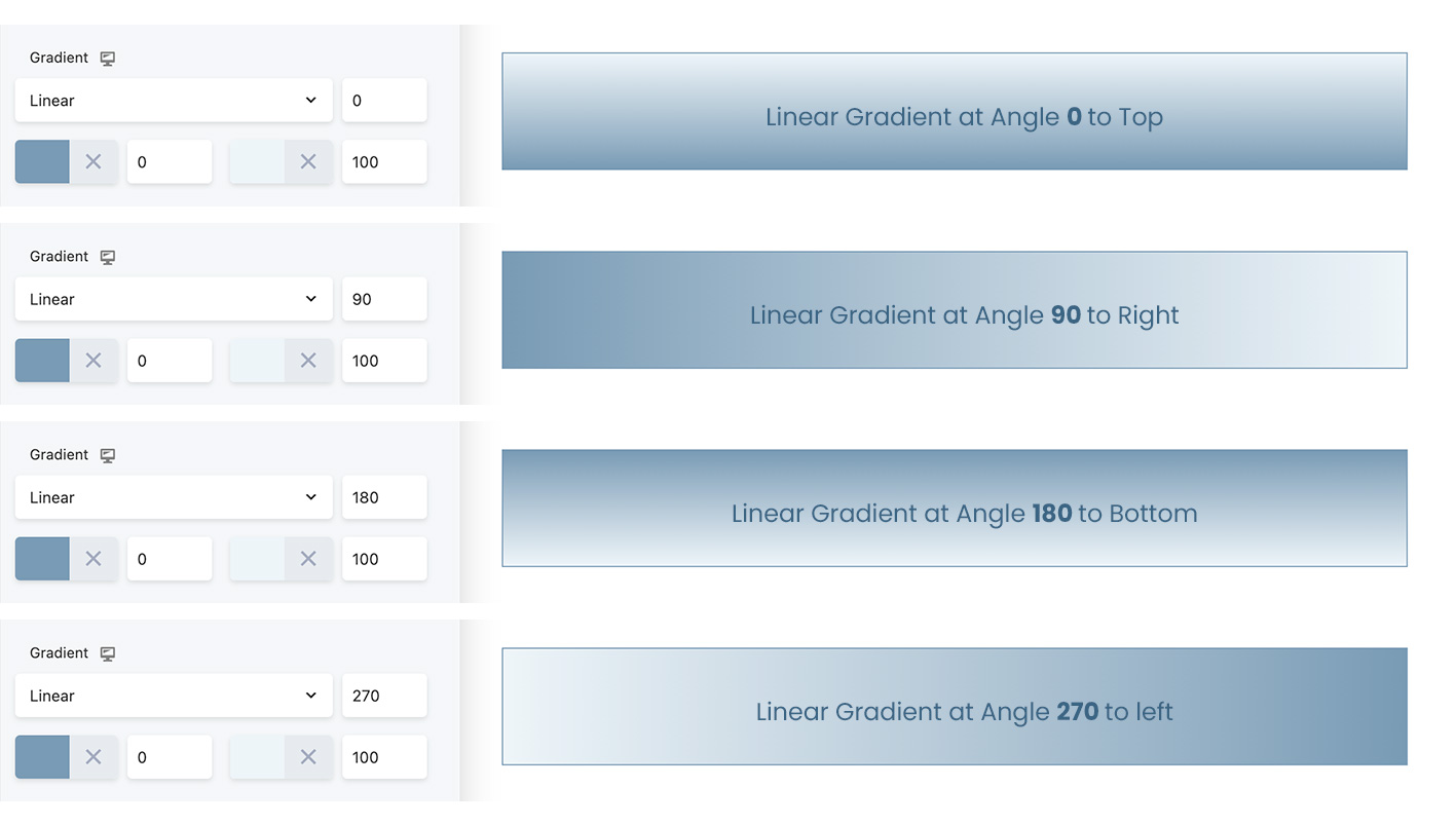
Note: Because the gradient line rotates on a circular axis and the row or column background is rectangular, the 0% and 100% positions can lie outside the row border for some angles. See this article on CSS linear gradients for a detailed description of how linear CSS gradients work.
Color stop position
You can vary the color stop position so the gradient starts and stops further inside or outside the endpoints of the gradient line.
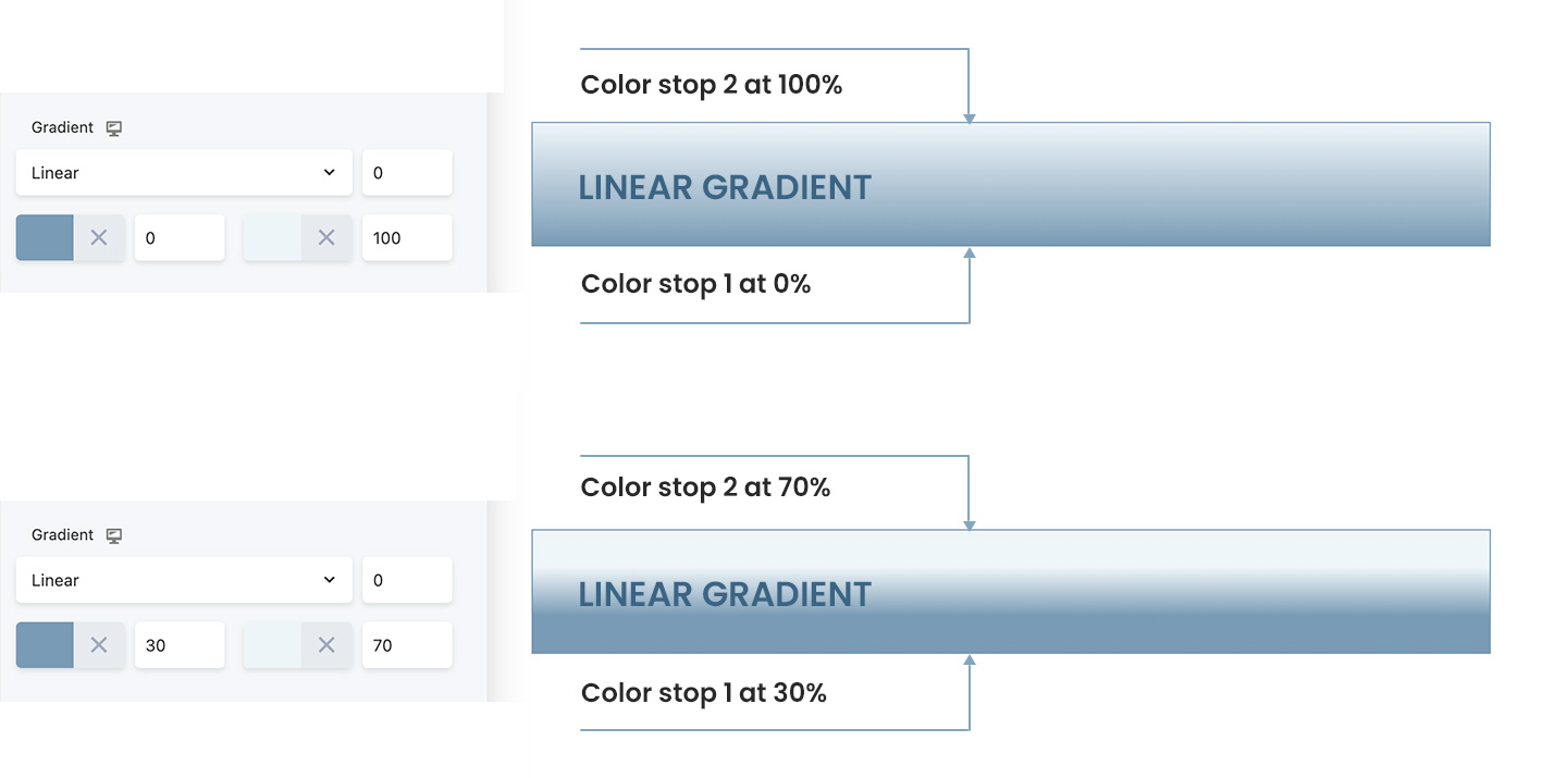
The following screenshot compares two examples in which the two colors are the same, but in the first case the stop positions are 0% and 100%, while in the second case the stop positions are 30% and 70%. In the second case, the gradient starts 30% in from the bottom of the row, and the second color has starts 30% in from the top of the row (100% – 70% = 30%).
In the following screenshot, the color stop locations are set at -40% and 140%, which causes the gradient to start and stop 40% further beyond the gradient line. This means the row background is only displaying the middle 20% of the entire gradient.

Note: If the Color 1 stop position is equal to or greater than the Color 2 stop position, the result is no gradient at all, as shown in the following screenshot, in which Position 1 is 30% and Position 2 is 20%.

Color opacity
Changing the opacity of the color in the color picker will also affect how the gradient appears. For background overlays, varying the opacity of one or both colors is necessary to let the underlying image or video show through.
Radial gradients
Radial gradients have the first color stop at a center point, radiating outwards in all directions to the second color stop.
You choose where to place the locus of the radial effect. The first color stop position of 0% is at that locus, and the second color stop of 100% is at the row border.
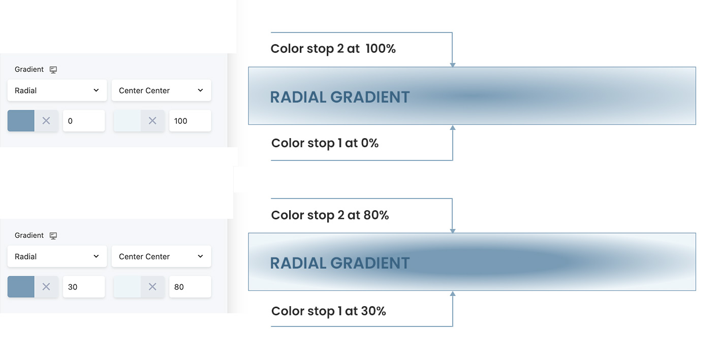
The examples in the following screenshot show a gradient with a Center Center locus. The first example shows a gradient with color stops at 0% (the locus you chose) and 100% (the row edge). The second example shows a gradient with color stop positions set to 30% and 80% respectively. The 30% means that there is solid color at the very center, fading out to transparency.
Like linear gradients, you can set stop positions at <0% or >100% to vary where the gradient starts and stops. If you set the Color 1 stop position to equal to or greater than the Color 2 stop position, the results is an oval with solid edges rather than a gradient.

