

The Button module is an exactly that: an object that you insert into your layout that resembles a physical button.
Uses of this module
- Traditionally, a web button is a pretty package for a link that sends visitors elsewhere when clicked.
- The button can also open a lightbox, which displays a video or any other content that you can insert with a shortcode, HTML, or code such as an
iframe.
TIP
You can play a video in a lightbox using either a Button module or a Video module. For a description of the differences, see the article about opening a video in a lightbox.
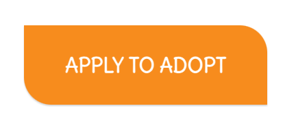
Button examples
Button style
Default button style
If you’re using the Buzz Builder Theme, the buttons’ initial style comes from the settings at Customize > General > Buttons. The button’s default text color is white text for darker accent colors and black text for lighter colors. The default font family for the button text depends on the font family set for the body tag.
Click Action: Link or Lightbox
You can set the button’s click action to either a link or a lightbox.
Set the click action to a link
When you set Click action to Link, a Link section opens.
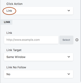
- Enter the URL to the link or click Select to choose a page or post from your site.
- Set Link target to determine whether the linked page replaces your current page in the same tab ( Same window ) or opens in a new tab ( New window ).
- The Link No Follow field tells search engines whether or not to follow the link. The default is No, which tells search engines to follow the link. Yes means “Yes don’t follow the link.” For more information about when to use
nofollow, see the Google webmaster article.
Set the click action to a lightbox
If you choose the Lightbox option, you next choose whether the lightbox will display custom HTML content or play a video from a URL you provide, as described in the following sections.
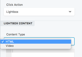
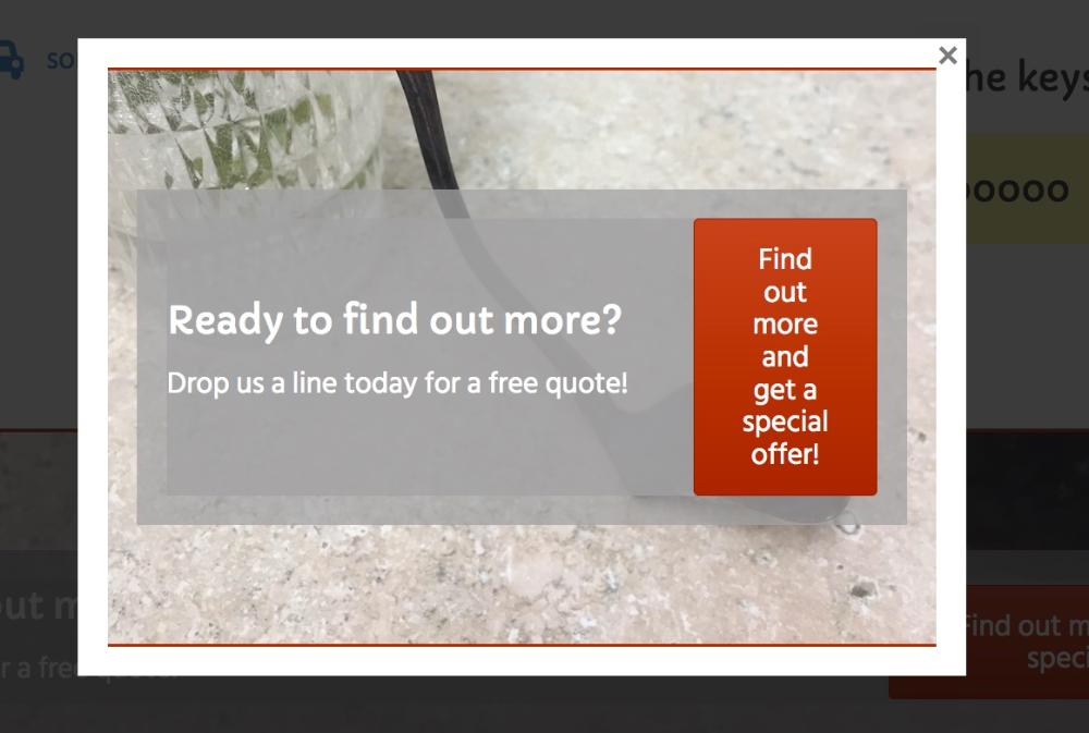
HTML content
With the HTML option, an HTML editing box lets you enter custom code such as HTML markup, embed code for a video, or shortcode. In the following screenshot, the shortcode for a saved row containing a Call to Action module was inserted into the HTML box to make an opt-in popup.
Other shortcode examples:
- Embed an audio player with audio shortcode.
- Use shortcode from a plugin to display the contents of a PDF file
TIP
You can click from a button to display individual images from a hidden Gallery module in a lightbox. Here’s how to do that.
Video link
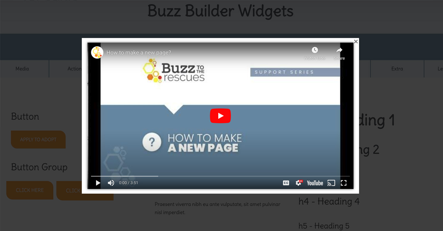
Insert the URL of the video you want to play in the lightbox, from a service such as Youtube or Vimeo:
Button settings
General tab
This tab has the following settings.
- Text
The text that appears on the button. - Icon
Optional icon to appear on the button. If you select an icon, there are two additional fields:
Icon position: Before or after the button text.
Icon visibility: The icon can be always visible or appear on hover only. - Click action
Link or Lightbox.
If you choose Link, a Link field opens for you to enter a typical URL link to another page or location.
If you choose Lightbox, a Content type option lets you choose either HTML or Video.
For HTML, add any code to display in the lightbox.
For Video, a field opens so you can provide a URL for a video from a service such as Youtube or Vimeo.
Style tab
The Style tab is shown in the screenshot and described below.
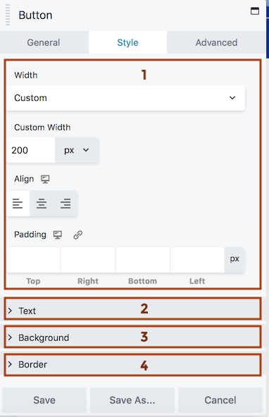
1 Top section
- Width
Auto width: Width adjusts to fit the text and icon.
Full width: The width expands to the content area minus the module’s margin settings.
Custom:
You can set a custom width in px, vw, or %. - Align (responsive)
See this article for a description of how the alignment toggle settings work. - Padding (responsive)
Set a specific padding value in pixels. Click the Link icon to automatically make all four padding values the same.
2 Text section
- Text color
Set the button text color in the resting state. - Text hover color
Set the button color on hover. If this setting is left blank, the Text color setting applies for hover also. - Typography section
See this article about the Typography section settings.
3 Background section
- Background color
Set the fill color for the button in the resting state. - Background hover color
Set the button’s fill color on hover. If this setting is left blank, the Background color setting applies to hover also. - Background style
Flat: consistent fill color
Gradient: gradient of the background color, lighter on top and darker on the bottom. - Background animation
Disabled by default. If set to Enabled, there’s a 0.2-second linear transition from resting state to hover state.
4 Border section
See this article for more information about the settings in the Border section.
Advanced tab
There are all the usual Advanced tab settings for margins, visibility, animations, and advanced HTML settings.
Related modules
Other modules that include a button:
- Button Group module
This module lets you add a group of buttons in a single column. horizontally or vertically. - Callout module
This module includes a heading, optional text, optional image (photo or icon), and optional button or link text. The link you provide works with any part of the Callout module, not just the button. - Call to Action module
This module includes a heading, optional text, and a button. The link you provide works with any part of the Call to Action module, not just the button. - Contact Form module
Special settings to set up a contact form, with a button to submit the form. - Subscribe Form module
Special settings to set up a connection to any of a number of mail service providers, creating a form to subscribe with a button to submit the form.
TIP
You can configure a Gallery module to open its component images in a lightbox with the addition of some code.