The Countdown module displays a visual timer that counts down to zero for a date and time that you specify. Scroll down to see screenshots.
General tab
You can specify the target date and time, including choosing the timezone that should be used.
Style tab
This tab has a top section of settings, followed by several sections that vary depending on the type of layout you select.
Top section
- Layout
The choices are:- Numbers This setting includes numbers plus the text under the numbers for each unit of measurement (days, hours, minutes, seconds).

- Numbers + Circles
Adds a circle around the numbers that visually shows the time remaining: number of seconds left in a minute, minutes left in an hour, hours left in a day, days, left in a year.

- Numbers This setting includes numbers plus the text under the numbers for each unit of measurement (days, hours, minutes, seconds).
- Alignment
This is the standard horizontal alignment toggle, which can be set to different alignments on large, medium, and small devices.
Numbers and Text section
- Number color
- Number typography
The standard Typography section for the numbers displayed. - Text color
- Text typography
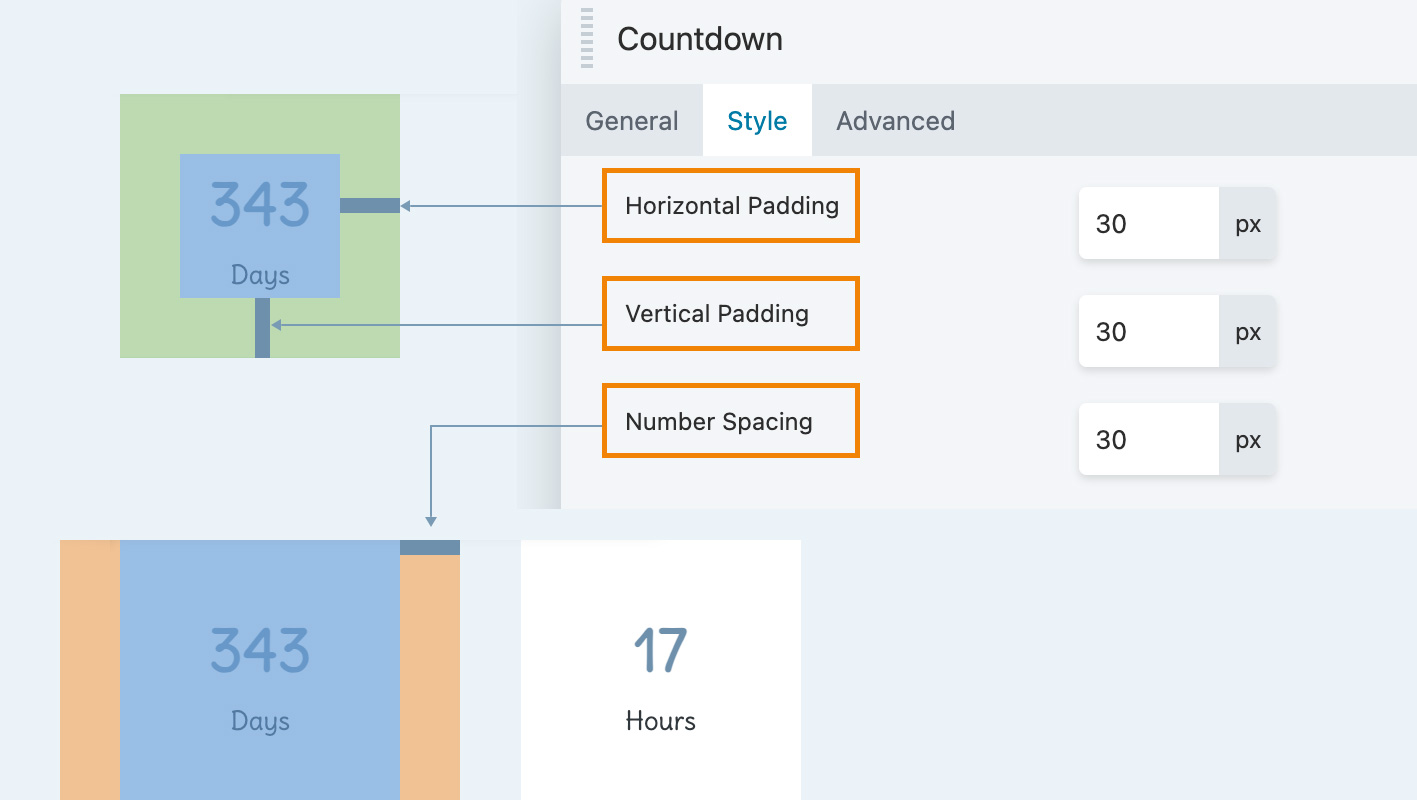
The standard Typography section for the text displayed under the numbers. - Horizontal padding (Numbers layout only)
Padding - Vertical padding (Numbers layout only)
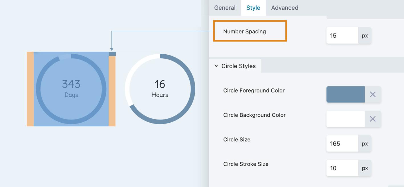
- Number spacing
Used in both types of layout to increase or decrease the left and right margins for individual numbers.
The following screenshot shows a Numbers layout with the Horizontal padding, Vertical padding, and Number spacing settings mapped onto a CSS box. The padding settings are associated with the fl-countdown-unit class, whereas the left-right spacing is associated with the fl-countdown-number class.

With the Numbers + Circles layout, only the Number spacing setting is available, so you can set only the left and right margins between numbers, shown in this screenshot.

TIP
- If the Circle size and Circle Stroke size are too large, they can overlap, as you can see in the screenshot. Check vertical spacing in responsive mode, as well as horizontal spacing in all modes – or make use of the overlap for effect!
- To control the space between the numbers and the circle, use the Circle size setting in the Circle styles section described below.
Backgrounds section
This section appears for the Numbers layout only.
- Number background color
Inserts a square of color behind the color/unit pair. - Number border radius
Rounds the corners of the background color squares.
Separator section (Numbers layout only)
- Show time separators Choose Yes to show a separator between each time unit.
- Separator Type
You can choose a colon or a pipe symbol as a separator. - Separator color Select the separator color.
Circle styles section (Numbers + Circles layout only)
- Circle foreground color
Displays the amount of time remaining in each time unit. - Circle background color
Displays the portion of the circle not taken up by the foreground color. - Circle size
Use this setting to control the distance between the text and circle. - Circle stroke size
Use this setting to increase the “fatness” of the circle.
Advanced tab
There are all the usual Advanced tab settings for margins, visibility, animations, and advanced HTML settings.

