The Button Group module is a way to display multiple buttons in a single column, either horizontally or vertically.

It’s based on the Button module, so the settings are very similar.
In the Button Group module, there’s a Style tab that applies to all of the buttons, and then there’s a Style tab for each button you create. Any setting on an individual button’s Style tab overrides the global setting for the button group.
TIP
If you’re using the Buzz Builder Theme, the buttons’ initial style comes from the settings at Customize > General > Buttons. The button’s default text color is white text for darker accent colors and black text for lighter colors. The default font family for the button text depends on the font family set for the body tag.
We’ll break down the settings by global button tabs and single button tabs.
Global button tabs
Buttons Tab (global)
Button group label
An optional label for accessibility that adds an aria attribute with the value you specify here. For example, if you add the label button group for this setting, the rendered HTML shows the attribute aria="button group".
Button 1
Click Edit button to configure the first button.
Add button
Click to create each additional button.
Style Tab (global)
This tab has four sections: a top section, Text, Background, and Border.
1 Top section (global)
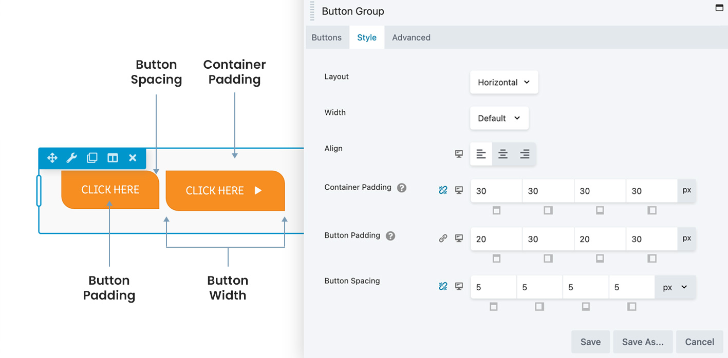
Here’s a diagram that illustrates the global padding, spacing, and width settings in this section. Each setting is described below.

- Layout
Choose a horizontal or vertical placement of the buttons.
TIP
A horizontal layout wraps the buttons to another line as screen size decreases. A vertical layout wraps the button text to another line as screen size decreases. Enter R on the keyboard to enter Responsive Mode to compare layouts at smaller screen sizes.
- Width
This setting controls the width of the buttons in the group. The values are Default and Custom but the behavior varies according to the type of layout.
When Width is Default and Layout is Horizontal, the width of each button varies according to the individual button text plus Button padding. This means that buttons with more text are wider:

Buttons wrap to a second horizontal line if necessary but the text doesn’t wrap.
When Width is Default and Layout is Vertical, the button spans the entire width of the container minus the Container padding amount. Button text wraps if necessary.
When Width is set to Custom in either horizontal or vertical layouts, the width of every button is set to the custom width you specify. Text wraps if necessary:

- Align (responsive)
This setting horizontally aligns the entire button container within its row or column. See this article for a description of how the alignment toggle settings work. - Container padding (responsive)
Adjusts the padding between the edge of the button group container and the group of buttons. - Button padding (responsive)
Adjusts the padding between the edge of each button and the button’s content. You can override this setting with the Padding setting on each button’s Style tab. - Button spacing (responsive)
Increase or decrease the amount of horizontal or vertical space around the outside of each button. You can set the spacing aspx,em,%, orvw. See the article about dimensional units.
2 Text section (global)
You can override all of the settings in this section on each button’s Style tab.
- Text color
Set the button text color in the resting state. - Text hover color
Set the button color on mouse hover. If this setting is left blank, the Text color setting applies for hover also. - Typography section (responsive)
See this article about the Typography section settings.
3 Background section (global)
You can override all of the settings in this section on each button’s Style tab.
- Background color
Set the fill color for the button in the resting state. - Background hover color
Set the button’s fill color on hover. If this setting is left blank, the Background color setting applies to hover also. - Background style
Flat: consistent fill color
Gradient: gradient of the background color, lighter on top and darker on the bottom. - Background animation
Disabled by default. If set to Enabled, there’s a 0.2-second linear transition from resting state to hover state.
4 Border section (global)
You can override all of the settings in this section on each button’s Style tab.
Border (responsive)
Creates a border around each button. See this article for more information about the settings in the Border section. You can override this setting on each button’s Style tab. Border hover color
Changes the background color of the buttons on hover.
Advanced tab (global)
There are all the usual Advanced tab settings for margins, visibility, animations, and advanced HTML settings.
Single-button tabs
General tab (single)
This tab has the following settings.
- Text
The text that appears on the button. - Icon
Optional icon to appear on the button. If you select an icon, there are two additional fields:
Icon position: Before or after the button text.
Icon visibility: The icon can be always visible or appear on hover only. - Click action
Link or Lightbox. With Link, there’s a URL field. With Lightbox, there’s a Lightbox Content section with Content type to either embed content into an HTML field or provide a video link.
See the click action examples in the Button module article.
Style tab (single)
This tab has four sections: a top section, Text, Background, and Border.
1 Top section (single)
- Padding (responsive)
Adjusts the padding between the edge of the button and the button’s content. - Text align
See this article for a description of how the alignment toggle settings work.
2 Text section (single)
- Text color
Set the button text color in the resting state. - Text hover color
Set the button color on mouse hover. If this setting is left blank, the Text color setting applies for hover also. - Typography section (responsive)
See this article about the Typography section settings.
3 Background section (single)
- Background color
Set the fill color for the button in the resting state. - Background hover color
Set the button’s fill color on hover. If this setting is left blank, the Background color setting applies to hover also. - Background style
Flat: consistent fill color
Gradient: gradient of the background color, lighter on top and darker on the bottom. - Background animation
Disabled by default. If set to Enabled, there’s a 0.2-second linear transition from resting state to hover state.
4 Border section (single)
Border (responsive)
Places a border on the edge of the button. See this article for more information about the settings in the Border section. Border hover color
Changes the background color of the buttons on hover.

